There’s a lot I like about being an author with Howard Books. A lot.
One of the things I appreciate the most? My editor, Jessica Wong, and the art director, Bruce Gore, invite me to participate in discussing the covers for my books. It’s an interesting process to get from my manuscript all the way to a cover that represents the story I’ve written — and it usually takes several attempts before we’re all satisfied.
What did the process look like for my most recent release, Catch a Falling Star?
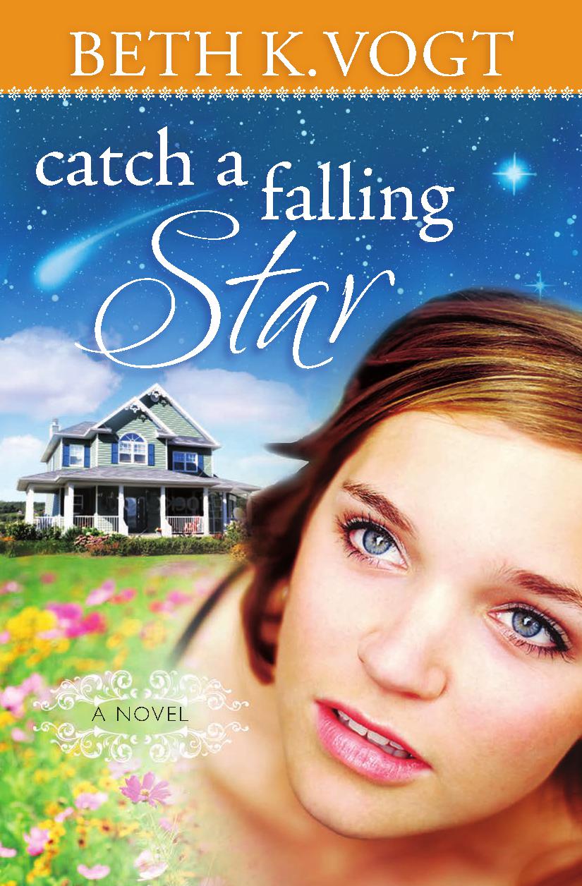
CAFS Cover Suggestion #1
1. Here’s an early cover suggestion: This idea carried over the same style for my name and a similar style for the title as was used in my debut novel Wish You Were Here — and I liked that. I also liked the falling star in the background. However, the woman representing Dr. Kendall Haynes, the heroine of Catch a Falling Star, seemed younger than 36 (a major issue for Kendall in the book), and the house didn’t accurately represent Kendall’s loft-home, situated within her medical office.
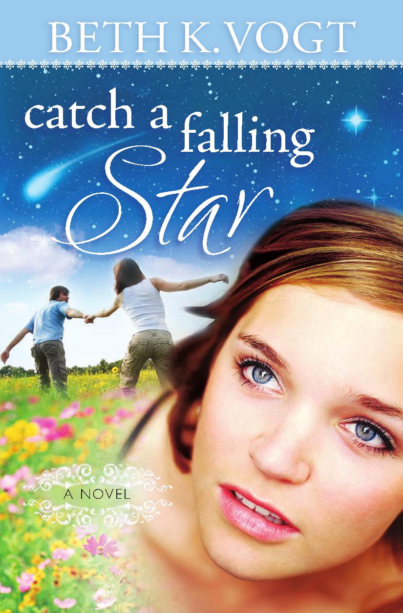
CAFS Cover Suggestion #2
2. A second cover suggestion: Once again, there’s the similar script for my name and the title, as well as the falling star in the sky. The hitch with this cover? The guy and the girl in this cover were having too much fun together! If you’ve read Catch a Falling Star, you know Kendall and Griffin Walker, the hero, start off more antagonistic than romantic. So, I couldn’t see the whole “walking in the flowers” scenario.
3. And a third cover suggestion:
With this cover rendition, we all felt as if we were closing in on the cover for Catch a Falling Star. The title font more closely matched the title for Wish You Were Here. I love the purple and the midnight blue colors, as well as the realistic night sky with the falling star. And the addition of the Jeep was perfect, since Kendall is a Jeep girl. The background also looks as if she’s looking out over Colorado Springs, CO — where the story takes place.
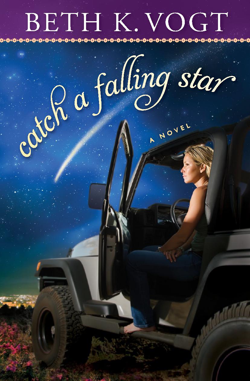
CAFS Cover Suggestion #3
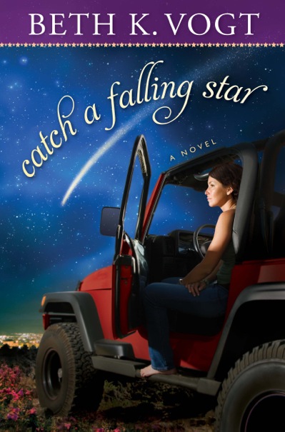
With just a few tweaks — Kendall’s hair color and the color of the Jeep — we ended up with the final cover for Catch a Falling Star!
So there you have it: The making of the cover for Catch a Falling Star! What did you think?
The making of a book cover: Catch a Falling Star Click to Tweet
The creative process of book covers Click to Tweet
Celebrating Book Clubs, Readers & Romance Click to Tweet
Comments 18
What a fun glimpse into a very professional process. So happy about your final selection. The earlier is similar to so many others, but your final is distinctive–like you, your plots, and skilled writing. Keep up the good work!
Thank you for always being such an encourager to me, Dee!
It was fun to share this behind-the-scenes peek at the book cover for CAFS — and yes, I love my final cover!
Thanks for showing what goes into making a cover. I love the final one. I also think it is awesome that they let you get involved. Covers are so important to the selling of a book. Yours are terrific!
I so, so appreciate that I am involved in the process too. It’s a privilege.
Oh how COOL!!!
I like how they listened and worked WITH you to get things just right.
I’m glad they didn’t have some bare chested Fabio-type with long hair blowing in the wind holding a star.
Cuz that’s MY cover….
You crack me up, girl.
🙂
Love seeing how covers come about. I think you definitely got the best result in the final cover. Looks great.
Thanks, Brittany. Yep, I love the final cover — and I love Howard Book’s art department and their creativity and brainstorming abilities!
I have to admit I almost choked when I saw the original cover, because I thought it was the cover for your next book. LOL! Definitely like seeing the process of a book cover’s creation and loved how it gave you the final result here. Quite the spectrum difference in this desire!
Sorry for the shock factor there, Casey …
Stay tuned for my upcoming book cover …
🙂
Haha, just proved you AND your publisher made the right choice. Can’t wait for that big reveal!!
Thanks for sharing, Beth! It’s fun to see how things grow and evolve, whether it’s book covers or ideas or even people. I wonder if the Good Lord Above often smiles at our “before” and “after” shots.
Love that analogy, Kathy, of our “before” and “after” shots.
The progression is interesting – and very relevant.
One reason I’m not enamored of the first two is a bit off-the-wall…the slightly “fish-eye-view” of the heroine’s face reminds me of the ads for the 90s movie “Tank Girl”. Never saw the film, bot the ads stuck in my mind – unfortunately.
The simple, rather wistful covers with the Jeep are so much better. They catch the “I’m getting older” feeling, and the hope of the shooting star.
Great job, and how nice to work with a good team!
The aspect of “team” is one of the things I value the most. Yes, we judge a book by its cover … but we often don’t see what goes on behind the cover.
Wow – such an interesting process. You all definitely nailed it with the fourth one. The first two covers definitely weren’t quite the right fit – I was looking at the house wondering if I had somehow missed a big rambling villa type house in the book!
Author
Exactly so, Kara!
How fun, Beth! Thanks for sharing the different phases of CAFS’ artwork. It’s neat to see the process.